Every year tens of thousands of runs are organized around the world. Among all these events, the marathon is the most emblematic and popular sporting event. For the year 2016, the ARRS (Association of road racing statisticians) evaluated the number of main marathons around the world to 366, involving more than 1.7 million participants. This popular enthusiasm does not seem to dry up over time and all countries are concerned by this phenomenon of society. It was in New York, more than 40 years ago that this ultra-elitist running race became a popular and festive sporting event.
Despite the difficulty of this 42.195 km endurance test, men and women, line-up by tens of thousands on the starting line. May they be international champions or occasional runners, be 18 years old or over 80 years old, they all have trained for months to compete in this running challenge.
But what do we know about these tens of thousands of runners? Apart from the gross list of results, participation and results of the best, only a few statistics are published.
There are, however, raw data about these runners which are available on marathon websites. The organizers make the results of all runners available and it is sometimes possible with more or less luckiness to recover all or part of all of these data. Some Internet users or researchers who have been able to extract these datasets also make them available..
My intention is to present statistical analyzes and original visualizations to highlight the information contained in these datasets. Who are these marathon runners and where do they come from? Do we see the same performance from one marathon to another? Are marathons faster than others? Have the performances changed from year to year? What are the most international marathons? And what can these data tell us about the history of these marathons? A lot of questions that marathonians ask themselves.
What do the raw data tell us?
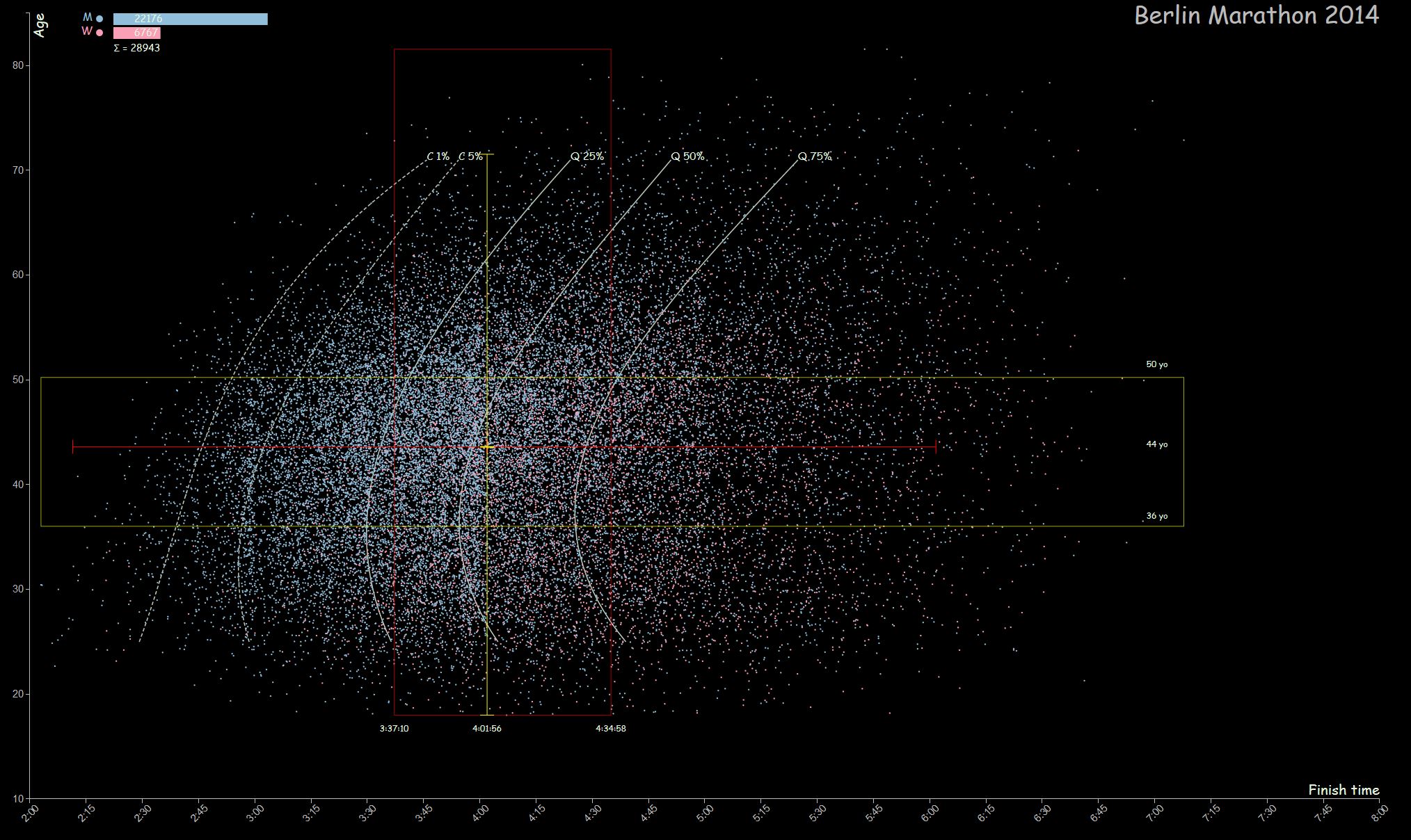
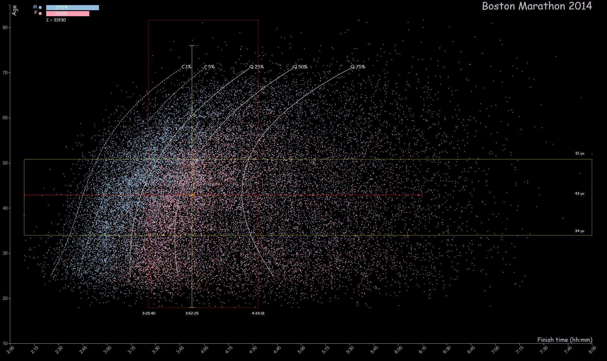
Let’s take a look at three famous marathons: New York, the most emblematic of all, Berlin which owns the highest number of world records and Boston, which is the oldest with 120 editions to its credit.
Berlin 2014 (click to enlarge)
Boston 2014 (click to enlarge)
New-York City 2011 (click to enlarge)
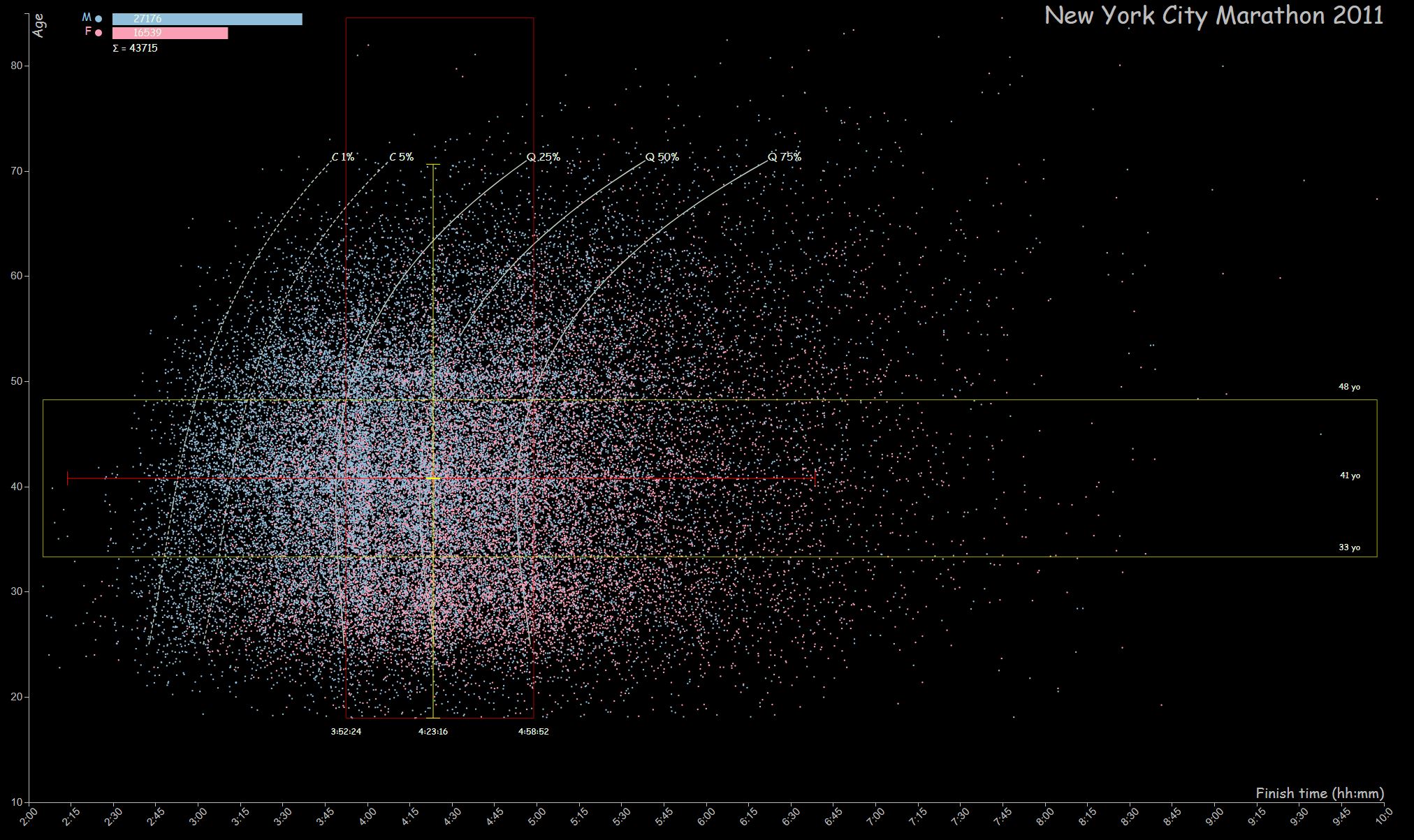
By presenting the raw data in the form of a scatter of points, our eyes perceive forms which they process to deliver information that could sometimes be difficult to highlight with statistical analyzes only. Straight away, you are able to materialize what represent more than 30,000 runners, what is the distribution between men and women; you can visualize the distribution of performances, the records of the event, the time of the last competitor and the amplitude of ages. On the Berlin marathon’s graph, our eyes are attracted by the concentration of points around the 3h, 3h30 and 4h axes, highlighting all the runners who managed to reach their goal of finishing under these reference times. It also highlight the competitive character of this marathon. Our eyes then linger on the points at the extreme ends of the graph such as the stunning performances of some older runners. They also very easily locate the central point of the cloud which represents a runner of approximately 45 years old and a time of 4h00. On the Boston marathon’s graph, the pink dots highlight the strong female representation. This strong presence of women contrasts with the Berlin marathon’s graph where the women participation is barely visible. The NYC marathon’s graph shows a strong concentration of points on the vertical of the 4 hours mark and also a concentration of points on the horizontal of the 50 years old which we cannot visualize on the other two graphs. This marathon seems to attract people in their fifties. By separating the results of men and women, one can better perceive this concentration by age, which is not restricted to men.
 Men
Men

Women
The scatter plot may be sufficient, but adding statistical elements to provide additional benchmarks enrich the graphs with information without compromising readability.
The quantitative values of men and women are presented in bars at the top left of the graph.
Two box plots are integrated in the graph. They represent the quantitative profile of the statistical series.
The box plots read as follows:
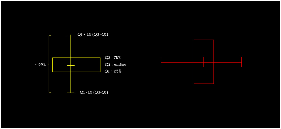
The yellow rectangles (box plot) on the graphs contain 50% of all participants: 25% below the median and 25% above. The median cuts the statistical series into 2 parts. So basically there are as many runners above as below. The ends of the vertical axis are used to visualize the extreme points of the series.
In the case of the Berlin Marathon’s graph, the median is 44 years old and 50% of the runners are between 36 and 50 years old. For the Boston’s marathon, the median is 43 years old and 50% of runners are between 34 and 51 years old. Figures for these two marathon are therefore fairly close even if there is a higher concentration around the median for the Berlin’s marathon. The NYC marathon however attracts a younger crowd with a median sitting at 41 years old and with 50% of runners between 33 and 48 years
The red rectangle is oriented in the other axis and gives information on the running times. For the Berlin’s Marathon, 50% of the participants ran between 3h35 and 4h34, and the median is 4h01min56sec. For the Boston’s Marathon, the median is 3h52min25sec and the box includes 50% of runners who clocked between 3h25min40sec and 4h33min18sec. Overall, Berlin Marathon runners were much slower and the 10 minutes gap is quite significant, especially considering the higher proportion of women in the Boston Marathon.
As of the NYC marathon, the median time of 4h23min is significantly higher (more than 20 minutes) than for the Boston and Berlin marathons (3h52min and 4h02min respectively). This difference reflects the festive nature of this marathon
span>
How performance evolves with age?
We can see on the graphs that the mass of points moves to the right in the upper part. This simply means that with age, performance decreases. The white curves make it possible to quantify this impact. They were realized by calculating the quartiles and some percentiles (1%, 5%) for each age category. In this way, a series of points is obtained, from which it is then possible to plot the series of curves.

Considering for example the Q25% curve and taking a point on this curve, all the points on the left of the horizontal axis correspond to the 25% fastest runners for this age category. So looking at the Boston marathon’s chart, a 35-years-old runner is expected to clock less than 3h14min to be in the fastest 25% of his age group, and this would be 3h44min for a 58-years-old runner, which is ½ hour more for an aged difference of 23 years (or a loss of 1min 15sec per year). A similar trend can be seen in the Berlin’s Marathon: 3h26min for a 35 years old and 3h55 for a 58 years old, which is 29 minutes more.
The curves show that the runners performances are better between 35 and 40 years old according to the quartile and percentile considered.
How does the performance improve during the race?
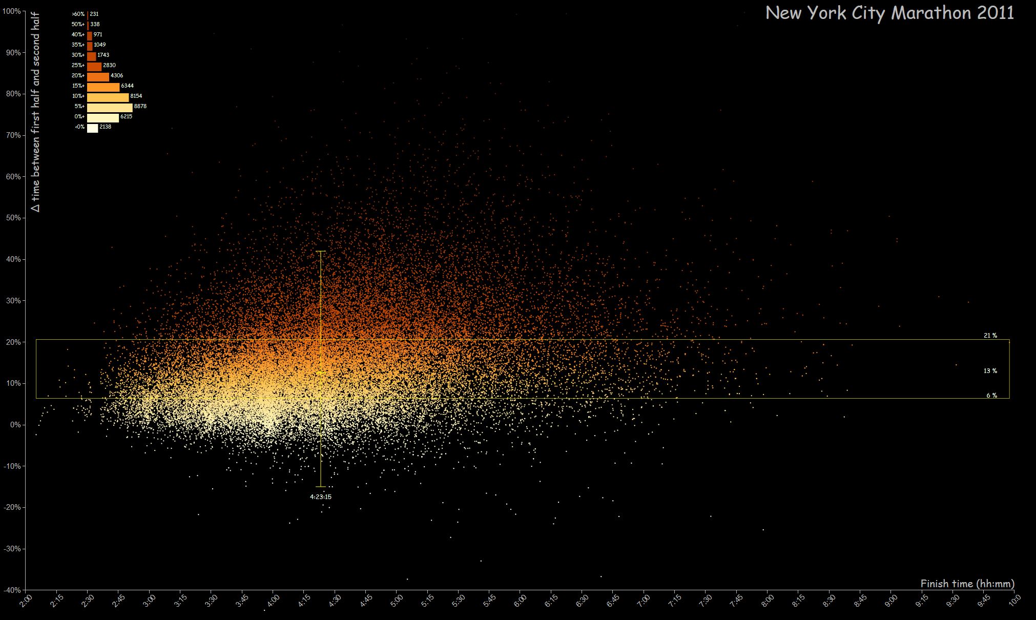
The Boston and New York marathon datasets also provide intermediate timing which enable the analysis and visualization of the variation in performances between the first half and the second half of the marathon for each runner. This time difference is expressed as a ratio in %. For example a runner who did 2h00 in the first half and 3h00 in the second half has a ratio of 50%.
The first graph shows this ratio as a function of the final time achieved and the second one according to the age. The points are colored according to the value of the ratio, higher is the ration, more the color tends towards the red. This allows to visualize the runners who have suffered on the second part of the race (who for some of them have met the famous marathon’s wall). We can see that the majority of runners suffered to finish the race.
Boston 2014 (click to enlarge)
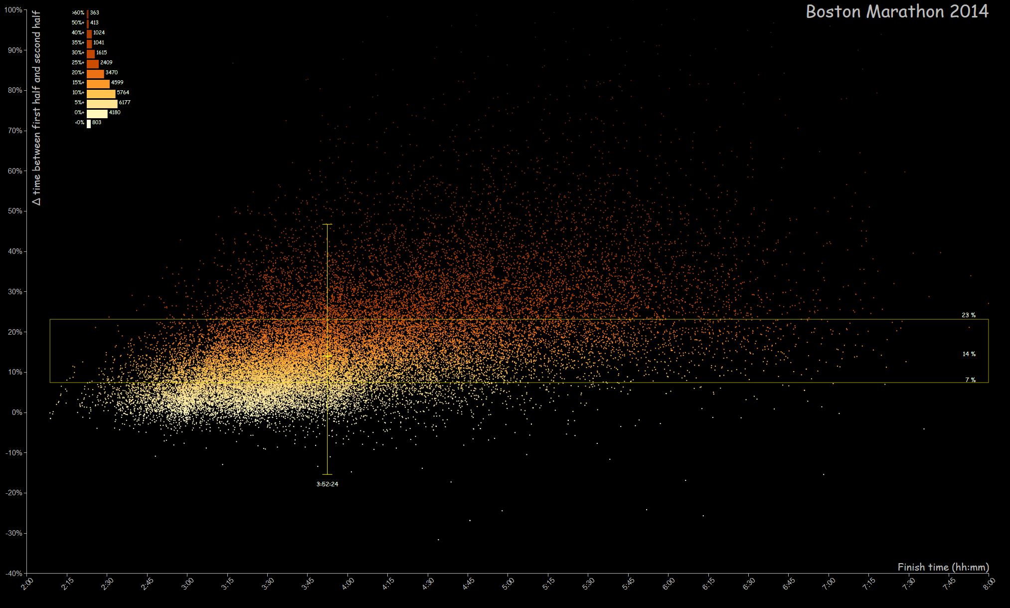
Boston 2014 (click to enlarge)
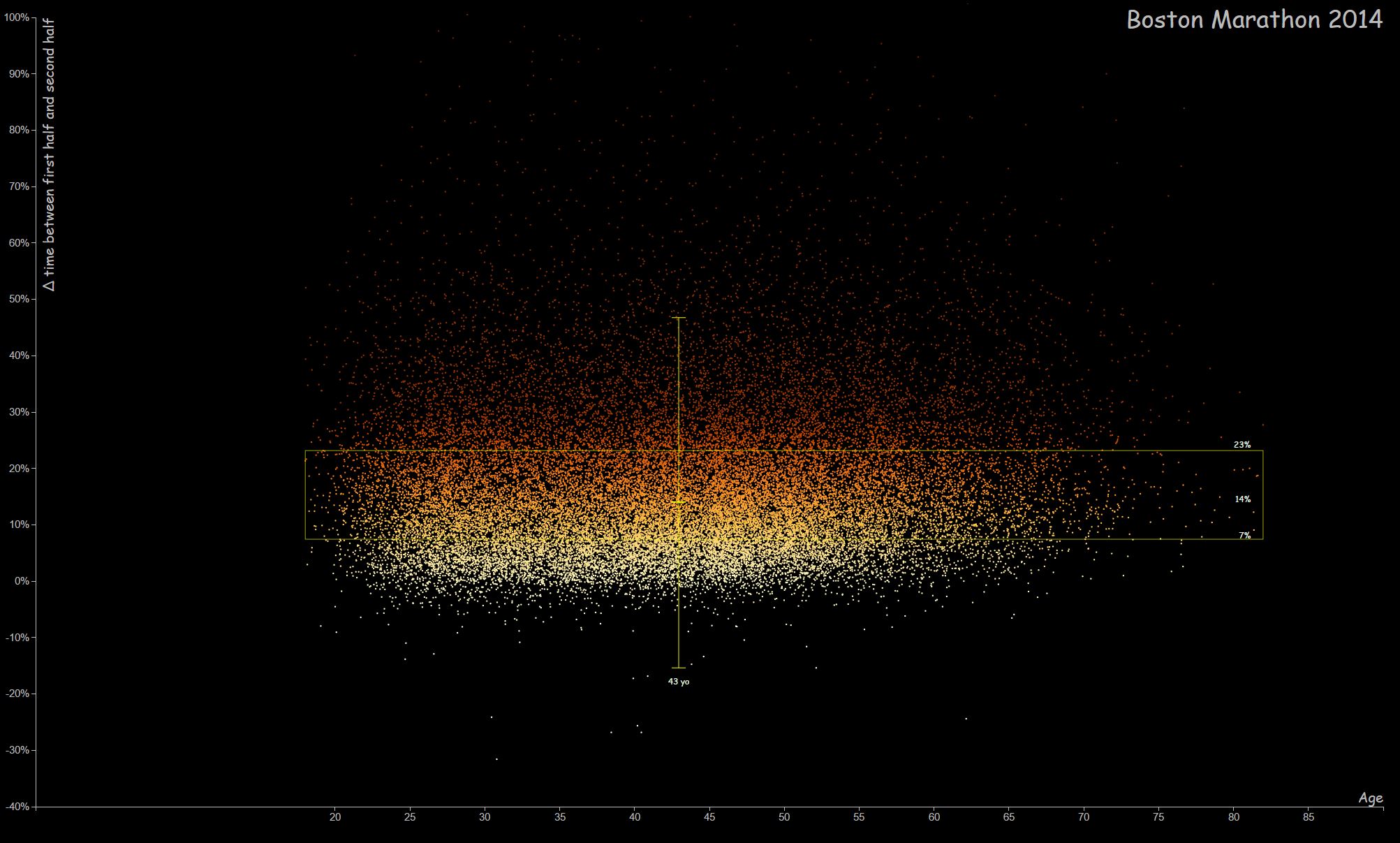
New-York City 2011 (click to enlarge)
How does performance evolve with temperature?
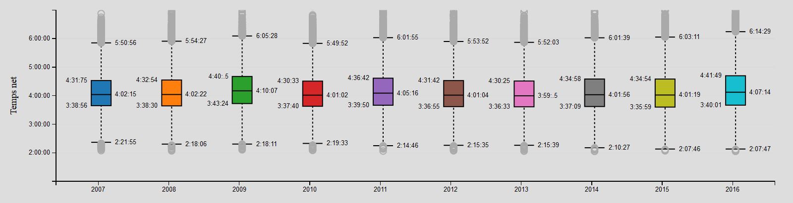
Analyzing the results of the last 10 marathons in Berlin using box plots, it can be seen that the median time can fluctuate significantly. For example there are more than 10 minutes difference between the 2009 edition (4h10min07sec) and the 2013 edition (3h59min05sec).
Such variation is statistically significant and it would be interesting to cross these values with other data such as the weather data for example. The website http://www.infoclimat.fr allows us to find the weather information at each marathon date.
By comparing the shape of the temperature curve measured at 1PM on the day of the race (which corresponds to the median time of the runners arrival) with the median performance time, we can already see a correlation between performance and this first weather parameter.
Temperature measured at 13h on the date of the marathons between 2007 and 2016
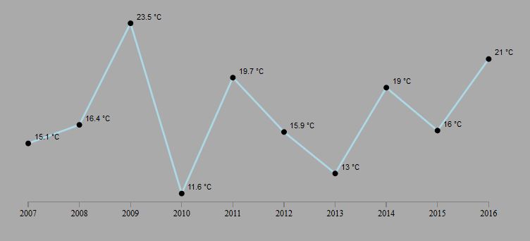
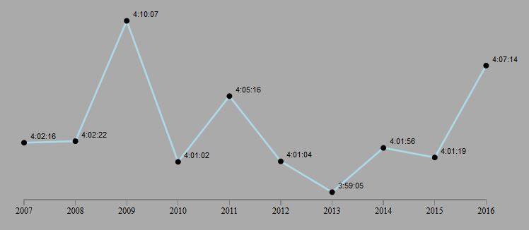
The higher the temperature is, the lower the performance is. On September 20, 2009 (the 2009 marathon date), the temperature was 23.5°C, while on September 29, 2013 (date of the 2013 marathon) the temperature was 13°C. This corresponds to a racing time variation of 10 minutes for a variation of 10°C in temperature : 1 min / °C.
By plotting the variation of the racing time median as a function of the temperature, we can extract the regression line and calculate the correlation coefficient which is 0.89. In the Statistics World this value is quite high which confirms the strong correlation between temperature and performance.

Variation of median performance as a function of temperature
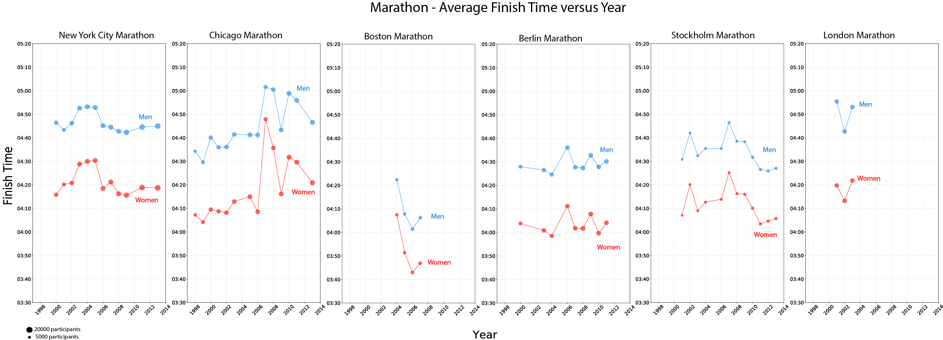
What difference of time between men and women?
By analyzing 1.5 million results corresponding to 55 marathons of more than 10000 runners, we can visualize the average values of each marathon and put into perspective the differences between men and women.
It is found that this difference is stable with an average of 25 ‘(with a standard deviation of 4’). The women spend 25 minutes more than the men on the course of the marathon …
This analysis and visualization work would be interesting to pursue with other data sets of marathons results and other parameters such as the runners country of origin, the weather data or other data. We could see if new major trends appear and if we can tune the signature for each marathon.
Note : All the graphics above have been coded in python and JavaScript, using the d3.js library, which allows a high graphic creativity.
Alain Ottenheimer (mars 2017 _ reviewed in september 2017)
Laisser un commentaire